
Plantiga 2.40
Introducing our updated Dashboard and all-new Overview! This one has been months in the making. Now you can visualize our core metrics in a much more intuitive way, both for individual athletes and across your team, as well as customize the Dashboard and Overview to your specific needs with a drag & drop widget layout.
We have also refined the look of the overall site for a more “lux” feel, updated one of our core machine learning modes for better auto-detection of walking and running, and released a number of insole options that we now offer teams and athletes as part of their onboarding.
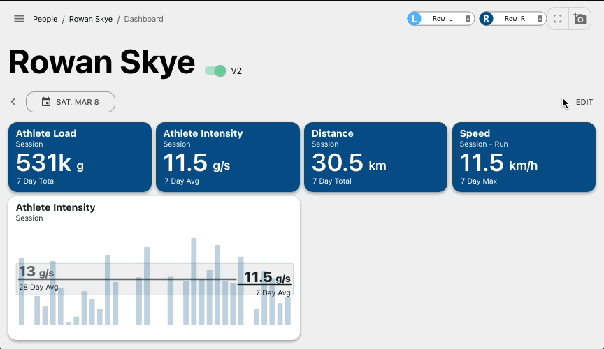
Updated Dashboard
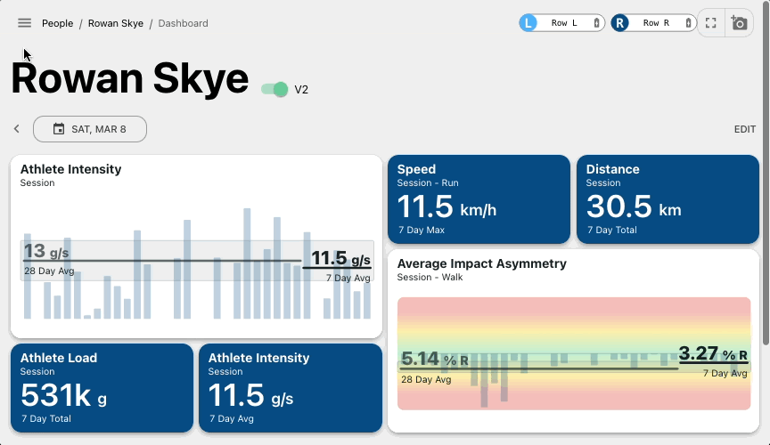
We have re-designed an individualized Dashboard with a widget based framework that can be adapted to different environments and needs - whether you’re closely tracking your athlete’s asymmetries during RTP or monitoring loads during games and practices.

Easy Customization
Select widgets of the metrics you care about for general sessions or specific movements, like running or jumping from games or practices. Choose the time range you’d like to assess (1 day, 7 day, or 28 day trend) and select one of the data visualization options. Customize as much as you’d like, and you can always restore our core template by clicking “Reset”.
Easy Navigation

Go day-by-day with the date arrows, or select a specific date with the heat map calendar.
The intensity of the color on the date indicates how much load was accumulated.
Please note the old dashboard will eventually be phased out. For the next month, you'll have the option to toggle between the old and new dashboards.
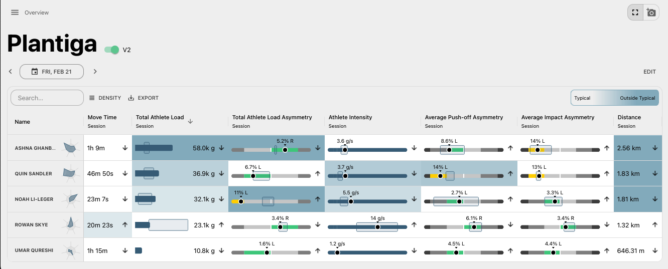
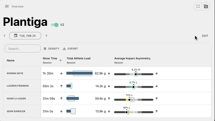
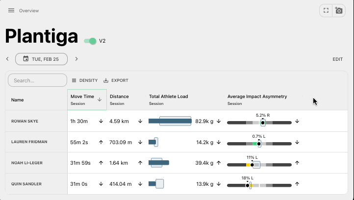
New Overview
View your entire organization in a single view. This is important for assessing team-wide trends, highlighting which athletes are outside their norms, or for group testing/larger data collection efforts.
Easy Customization
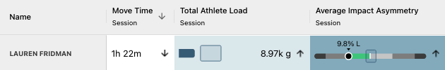
We designed the Overview page as a customizable table where each column shows a daily summary of a metric. It allows flexible configuration and easy CSV export for data sharing.
Dive Deeper
Double click any cell to view the trend for that specific athlete. Click a column to sort its values in ascending or descending order. For example, sort individuals by most/least distance covered that day.
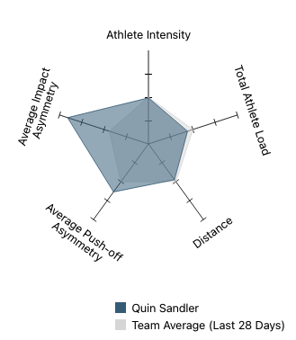
Compare Across the Team
Quickly view how an athlete stacks up against the team with the radar chart next to their name. The axes of the chart will reflect the metrics that are selected in the table.
Stay Focused
Turn on the heat map to see which athletes are outside of their typical ranges, helping you hone in on the ones that might need more attention. The cells with higher intensity of colour are farther outside the athlete’s typical range.
More new features & updates!
Check out our latest blog post on using Plantiga in soccer (football for anybody outside North America ).
New Team View navigation from the People side bar section, enabling you to go between Dashboards quickly.
We updated our process for embedding the sensors into orthotics, sock-liners, and in shoes themselves. Check out the step-by-step guide.
We updated our API documentation and added additional endpoints as more and more groups are needing advanced API functionality.
Thanks for reading this update! Please don’t hesitate to reach out with any questions, comments, ideas, or anything else related to what we’re building.
Many thanks!
Quin and the Plantiga Team