
The Data Behind the Decision
How Joey Kalbas, Director of Data Analytics at a D1 Tennis Program, stopped guessing and started knowing
Practitioner
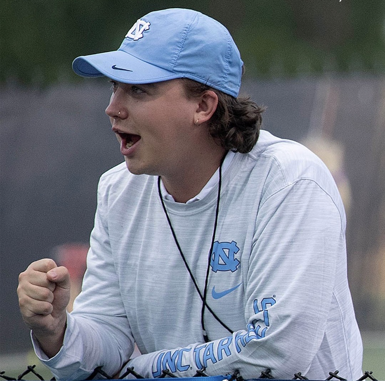
Joey Kalbas
Setting
NCAA Div. 1 Tennis
Role
Director of Data Analytics
Ranking
Top 10 nationally for over a decade
For six seasons, Joey Kalbas has watched his program compete at the top of Division I tennis. As Director of Data Analytics for a program that has maintained a top-5 to top-10 national ranking for over a decade, his job has always been simple in theory and complex in practice: give the coaching staff the clearest possible picture of their athletes, so they can make the best possible decisions.
For a long time, that picture had holes in it.
A sport that outpaced its own monitoring
Joey's program didn't lack technology. Two years ago, they brought on Catapult — a GPS-based wearable platform that gave them a meaningful window into how tennis players move through a match and what training demands actually look like. It was a step forward. But tennis, as Joey learned, has a way of humbling even well-designed systems.
"Tennis is a very lower body based sport," he explains. "Being able to look at how much you're using on a per-side basis has been huge for us." Catapult captured whole-body movement metrics. What the staff needed was per-leg data — the difference between symmetrical effort and a player quietly compensating for one side while the coaching staff remained unaware.
Then there was the indoor problem. Half of the spring season is played indoors. GPS doesn't work indoors, meaning that they were missing out on a lot of really valuable data.
“Our biggest challenge was finding a way to use the same metrics every single day, no matter where we are.”
The data stream had gaps. And in a sport where individual player health can swing a team's seeding, ranking, and tournament fate, gaps are expensive.
Problem 1
Whole-body data — not per-leg
Catapult captured how players moved as a centre of mass. But tennis is a lower body sport — and what mattered was left vs right, not the average of both.
"Being able to look at how much you're using on a per-side basis has been huge for us."
Problem 2
GPS does not work indoors
Half the spring season is played indoors. GPS doesn't work indoors. Every indoor match and practice session was a blank in the data stream.
"You're losing a lot of really valuable data. Our biggest challenge was finding a way to use the same metrics every single day."
The entry point: one athlete, one season
Plantiga entered the picture through a single player — a decision that felt low-stakes at the time but proved to be a proof of concept for the entire program.
The athlete had a history of knee injuries. Two consecutive seasons had ended early because of them. Going into this year, with a deep and talented roster, the staff knew they had options. But they also knew this player was integral to the program's ceiling.
“We wanted a very good sense of — hey, is this player leaning more towards her injured side? Maybe this is a good weekend to sit her down.”
The goal wasn't to sideline her. It was to make informed decisions rather than reactive ones — to use data to separate fatigue and asymmetry from genuine injury risk before it became a real problem.
What convinced the staff to expand further was simpler than expected. "Frankly, how awesome all the dashboards are — out of the box — and how easy everything is to understand." Before the team headed indoors and risked losing meaningful data collection continuity, they made sure as many athletes as possible were in the system.
Seasons 1 & 2
Two seasons ended early
A key player had ended two straight seasons early with knee injuries. No way to track load or flag asymmetry in real time.
Season 3 · The pilot
Plantiga introduced for one player
Plantiga introduced for one player. The goal: separate normal fatigue from real injury risk before it became a problem.
Before the indoor season
Expanded to the full roster
The pilot worked. Dashboards were clear, value was immediate. With the indoor season approaching, the staff moved fast to get the whole roster into the system.
The moment that mattered
If there was a single moment this season that validated the investment, it came during a week that would stress-test any program's decision-making.
The team was scheduled to play a rival on Friday and the number-one ranked team in the country on Sunday — with national championships the following week. The Friday match was gruelling. And in the aftermath, a player who already had a lower body injury appeared to aggravate the other leg.
The consensus was almost immediate: rest her. Protect her for nationals. Don't risk a long-term asset for a single match against the top team in the country.
But Joey and the program's athletic trainer looked at the jump test data first.
“Her data looked exactly like we would expect from any other player the day after a match. We presented the coaching staff and said: we believe there is no increased risk from her playing on Sunday.”
She played. The team won — defeating the number-one program in the country. That victory wasn't just a result. It was a seeding. Winning has placed them in the drivers seat for a top-8 national seed, which could mean hosting the first three rounds of the NCAA Tournament.
“If you take that win out, we would have been fighting tooth and nail to get that top-eight seed. A single data-backed decision reshaped the entire postseason picture.”
What's next: movement, biomechanics, and the unexplored
Joey's vision for where this technology goes next is as specific as it is ambitious.
“If you can integrate it with video — look at when a player is going into and out of a groundstroke or a serve, look at how their legs are moving — you start to ask: is one leg not moving fast enough relative to the other, and is it causing them to hit a weaker ball?”
The application spans both real-time performance and lab-based biomechanical standards. What should an optimal tennis stroke look like from a lower body standpoint? What asymmetries are acceptable, and which ones are quietly degrading shot quality over a long season?
For Joey, these are no longer hypothetical questions. They're the next frontier — and the foundation is already in place.
Video + sensor integration
Linking lower body movement data to video of each stroke — groundstrokes, serves, transitions.
Per-leg stroke analysis
Identifying whether one leg is underperforming during a stroke — and whether that's degrading shot quality.
Biomechanical standards
Defining what an optimal tennis stroke looks like from the ground up — and which asymmetries are acceptable over a long season.
Joey Kalbas is Director of Data Analytics for a top-10 nationally ranked Division I tennis program.